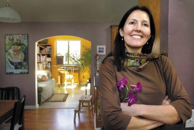
Martine Baker designs from the approach of color and how it affects the interior of the home. She uses flowers, pillows and artwork to introduce color into neutral spaces. (Mail Tribune / Bob Pennell)
By JOHN DARLING, for the Mail Tribune Interior design consultant makes her decisions for the home only after she gets to know you
–
Making over the interior of your home can be daunting, both in money and mistakes … but … what if you keep it simple? What if you commit to a theme, buy a few pieces of new furniture and & focusing mostly on color (especially unusual colors) & try to make your living space like a Monet painting?
That’s the approach Martine Baker takes, an artist turned interior design consultant who also calls herself a “color intuitive.” That’s someone who throws out the traditional, toned-down color palette, studies surroundings, personality and favorite colors and melds them into an environment that people really want to live with.
When she first walked into Rebecca McLennan’s modest Ashland home she saw a plain vanilla interior with boring oatmeal carpeting and veneer panel walls.
Baker’s comment? “You’ve got a long road ahead.”
“The low ceiling was oppressive. I hated everything about the house,” says McLennan, who bought it five years ago for $200,000 and was working on a modest remodeling budget. Baker’s first task was getting to know her client.
“I intuit what’s theirs. Sometimes, you can see a theme under the hodge-podge, but it isn’t a match with who they are,” she says. “I see some colors and I run with it. I guide and help. People have a lot more color sensibility than you think.”
She saw that McLennan liked color, loved nature and made little altars of natural objects. “Rebecca is rather dramatic and she wanted her house to show that,” says Baker.
Out went the carpet. In came laminate oak flooring. Up went the low roof, creating an open cathedral ceiling. Slate replaced the mundane red brick fireplace. These were the the expensive items. The rest was about color.
Baker put calming, silver sage paint on the fireplace wall and its opposite wall, then balanced it with muted purple on the other two living room walls, a subtle shade that is echoed through much of nature.
Looking through an arch from there, the far room, a study, beckons with warm mango. The kitchen and nook, between the two rooms, are a soothing dusty lilac, resonating with the blue and white speckled counter.
The study has mango on the one wall only, allowing natural light to bounce it around the other three off-white walls. It was styled after an inspiring Australian sunset, something McLennan had seen in real life, she says, and that brought vibrance into the house.
Three sections of a new living room sofa are an earthly, warm khaki & an “anchoring color,” as Baker puts it, that’s not too bold, but allowed McLennan to go for it with “opulent splashes” of gem colors in her pillows and other accessories such as “very stylish genuine silk pillows and only $14.99,” bought at an area department store.
“With the anchoring colors, you’re not expected to respond to them, but rather to be optically soothed and comforted,” Baker says. Other such colors are gray, tan, beige, sand, taupe and umber.
“Because there is so much color everywhere else, the couches tie everything in and leave you a lot of room to be creative. Their colors deter dirt, too.”
Two new living room skylights splash light around the room, even on cloudy days, and McLennan has to be conscious of using yellow, which, mixed with blue, can give an unintended green.
Colors reflect and affect mood, Baker says. In the optimistic 70s, people went with oranges and greens, and in times of war and fear, people seek cave-like protection in browns and “you now see a dimming of the color palette worldwide,” she says.
Some people need to be energized with colors that have lots of “chroma,” like yellow, or calmed by oceanic feelings that come with blue, she notes, adding that too much green can depress.
In remodeling, Baker says, colors can be scary. Color is a big step that can be cushioned by getting a big piece of sheetrock, painting it with your out-of-the-box color and leaning it against a wall for a few weeks to see if it locks in, says McLennan. Even if you make a mistake, she adds, “paint is cheap.”
Opening the front rooms of the home to color can make resale more difficult, at least according to cultural myth, but, jokes McLennan, she can’t live for that end. “They’ll have to deal with it. You walk in, you feel good, you relax, you plunk down your money.”
Window treatments are simple & she installed pull-up/push-down honeycomb blinds that let you cover the bottom half of the window for privacy but keep the top part open for nature and sky.
An often overlooked touch in both color and livability is springing for at least one large piece of original art, says Baker. McLennan’s is a simple, sizeable water color of wild grass (by Baker) facing the entrance.
McLennan’s mini-altars have a bowl of beach stones with a tiny, motor-driven water feature spreading a trickle sound through the living room, abetted with candles, a Buddha statue, flowers and a book of poetry by her favorite, Rumi.
It’s peaceful and spacious feeling, though it’s a small, single-story home and, says McLennan, it took a lot of relearning about getting “stuff” out of your space, only allowing in objects that go with the design’s mission and, hardest of all, passing up great sales on goodies that just don’t have a place in her new look.
In the process of doing the remake, Baker also doubles as an educator, says McLennan “and when I shop, I’ve got Martine right on my shoulder, reminding me what works.”
About clutter, Baker notes, “It’s a habit that needed to change. You need to get to the point where it’s uncomfortable and you’re ready. Instead of leaving papers around, put them in a beautiful container. Take a couple days asking what you can get rid of & but don’t go overboard with the minimalization trend. It’s an intrinsic need that everything belongs somewhere, just as we belong somewhere.”
An art graduate of Humboldt State University, Baker lives in the Colestin Valley, paints fine art to satisfy her own creative needs (often drawing inspiration from the desert shades she grew up with in the Death Valley region) & and serves clients at $50 an hour, with the first consultation free, mostly in the Rogue Valley area. Call 301-5273.
“I’m happy with what we’ve done,” says McLennan. “When I come home, I’m drawn in, in a serpentine way to the back room, with its mango paint, then I’m drawn back to the peace of the living room.”
John Darling is a freelance writer living in Ashland. E-mail him at jdarling@jeffnet.org.
COLOR & ITS EFFECT ON MOOD
Comments from “color intuitive” design consultant Martine Baker
Red: warming, vitalizing, stimulating, good for kitchen, as it spikes appetites.
Orange: social, fun, playful, warming
Yellow: cheerful, uplifting, tends to bring in light
Green: soothing, nourishing, especially in nature tones
Blue: calming, cooling, soothing
Pinks and peach: soften a room, inspire love and romance
Purple: meditative, opens vision, senses, so take in other colors
White: purifying